PACKAGING FOR MORE SUSTAINABLE BREAD CONSUMPTION
Countries in the EU alone waste around 88 million tonnes of food every year. And one of the items which is most commonly thrown away, is leftover bread.
CONCEPT
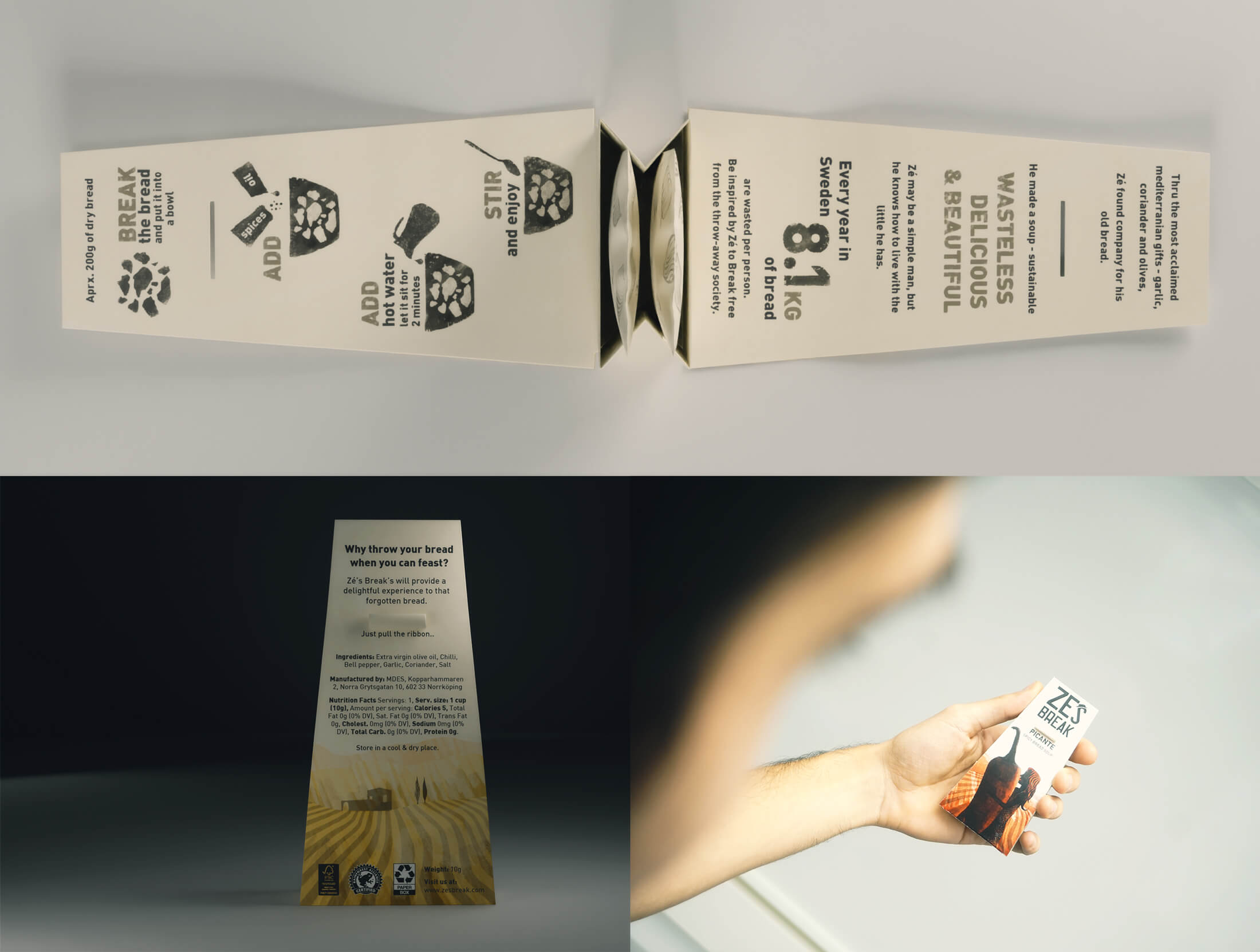
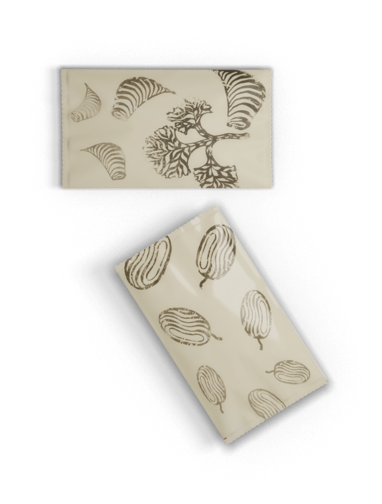
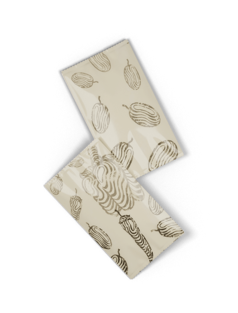
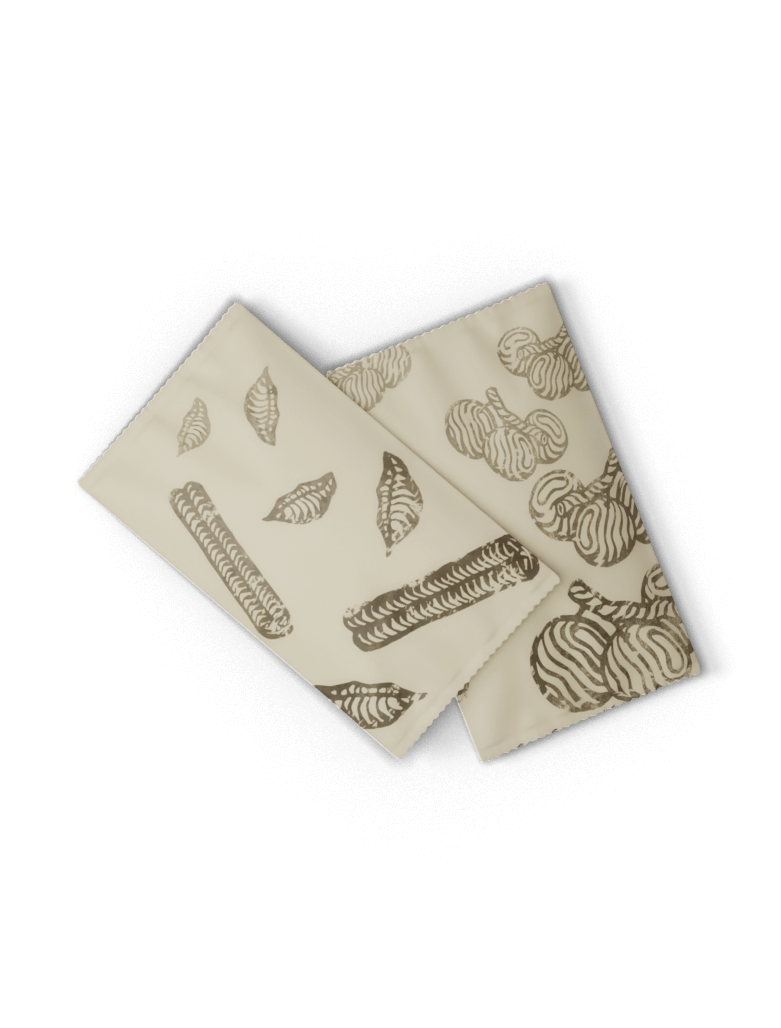
As an answer to this problem we have developed the packaging concept “Ze’s Break”, marketing a recipe for Portuguese bread soup. The so-called Açorda is traditionally prepared from old bread and few simple ingredients that we provide in small sachels. This way even very old bread can be turned into an enjoyable meal.
This critical design project does not need to be evaluated as a business plan, but rather an impulse that seeks to encourage more critical, individual thought on food consumption habits. Bread as an elementary part of many people’s diet is an interesting starting point.
Of course, food waste is not merely a European problem. Therefore, we do not believe that this project is defined by the context of a specific country. Instead, Ze’s Break would target the growing group of environmentally-conscious consumers willing to reflect and pay extra for sustainable practice.


PRODUCT LINE
Zé Povinho is the cartoon personification of a Portuguese everyman created by Rafael Bordalo Pinheiro in 1875. From a symbol for the rural working class the figure evolved into a humorous exaggeration of the Portuguese identity. Ze might be the caricature of an overly simple mind, but for us this is just the trait to establish identity for our product. After all we want to demonstrate that at times no complex solutions are needed to confront issues of sustainability. The soups presented below are three variations of the traditional recipe.

ORIGINAL
Olive oil with flavors of garlic and cilantro


PICANTE
Chili and capsicum are added to the original spice mix.


DEAD HORSE
For the adventurous: A sweet mix of red wine with cinnamon and clove

PLACEMENT
The product would ideally be on display in close proximity to bread, either in a supermarket’s bakery section or on the counter of bakeries. The placement of Ze’s Break would ideally be combined with the introduction of an old bread giveaway container.
As the package itself is quite small, the logo was designed to stand out by contrast and size in the upper part.
